How to Read Crypto Charts: A Trader's Guide to Technical Analysis
Technical analysis is basically the art of staring at a price chart long enough to make an educated guess about where things go next. That's the honest version. The textbook version is that you're...

Technical analysis is basically the art of staring at a price chart long enough to make an educated guess about where things go next. That's the honest version. The textbook version is that you're evaluating historical price and volume data to forecast a cryptocurrency's next move, ignoring the whitepaper and the team and the shiny use case, and betting instead that human behavior around money repeats itself. Which it does, by the way. Fear and greed haven't been reinvented lately.
If you've ever opened TradingView or Binance and felt like you were looking at an EKG readout designed by a caffeinated toddler, you're not alone. The good news is you only need to understand a handful of things: candlesticks, support and resistance, and maybe three or four indicators. That's it. Everything else is decoration.
So let's get you from confused chart-starer to someone who can actually read the thing.
Table of Contents
- What Is Crypto Technical Analysis?
- How to Read Crypto Charts: Candlestick Basics
- Understanding Support and Resistance Levels
- Common Technical Indicators Used in Crypto Trading
- Chart Patterns Every Crypto Trader Should Know
- Building a Crypto Technical Analysis Strategy
- Common Mistakes When Reading Crypto Charts
- FAQ: Crypto Technical Analysis
What Is Crypto Technical Analysis?
Crypto technical analysis is the study of price charts, volume, and statistical indicators to predict where price goes next. That's the opposite of fundamental analysis, which digs into a project's actual value, its adoption, tokenomics, developer activity, all that. Same discipline stock and forex traders have used forever, just bolted onto a market that never sleeps and swings way harder.
The whole thing rests on one assumption: everything worth knowing (news, sentiment, supply, demand) is already baked into the price. So instead of chasing headlines, you read the price. Traders who buy into this believe price moves in trends, and that patterns like a breakout above resistance or a golden cross keep showing up because people keep panicking and getting greedy in roughly the same ways. And they do. A 2023 survey by the Financial Conduct Authority found that roughly 12% of UK adults held or had held cryptocurrency, and more and more of those retail traders lean on charting tools now rather than just reacting to whatever's trending on Twitter.
Here's what I'd tell any beginner though: this isn't a crystal ball. It's a probability game. You stack up a few signals, candlestick shape, support levels, volume, an indicator or two, build a case for a trade, and then you plan for the very real possibility that you're wrong. The traders who forget that second part don't last long.
How to Read Crypto Charts: Candlestick Basics
Reading crypto charts starts with candlesticks, those little colored bars that show price action over whatever time chunk you pick, a minute, an hour, a day. Each candle packs in four numbers: the open, the high, the low, and the close. And the color tells you instantly who won that round, buyers or sellers.
Anatomy of a Candlestick
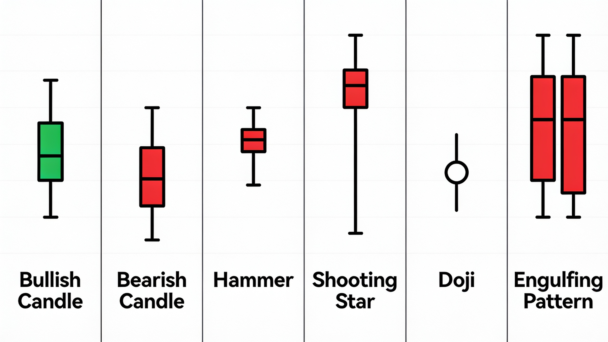
Every candle has two parts. There's the body, the thick rectangle showing the gap between where price opened and where it closed. Green (or white) means it closed higher than it opened. Red (or black) means it closed lower. Then you've got the wicks, sometimes called shadows, the thin lines poking out top and bottom that mark the highest and lowest prices hit during that period.
A long body with stubby wicks? That's momentum. Somebody was in control and didn't let go. A tiny body with long wicks on both sides is the opposite: pure indecision. Traders call that a "doji," where buyers and sellers basically wrestled to a stalemate and nobody got what they wanted.
Reading Candlestick Patterns
One candle rarely tells you much on its own, so you read them in little clusters of two or three. A few patterns come up constantly, and these are the ones actually worth memorizing:
- Hammer — small body up near the top, long lower wick, often popping up at the bottom of a downtrend to hint at a reversal.
- Shooting star — the flipped version, long upper wick near a possible top, suggesting sellers are stepping in.
- Bullish/bearish engulfing — two candles, where the second one's body totally swallows the first. Often marks a short-term turn.
Now, the thing nobody tells beginners loudly enough: timeframe changes everything. A hammer on a 15-minute chart is basically noise. A rounding error. The same hammer on the daily or weekly? That means something, because it reflects thousands of traders agreeing on a direction over real time, not two scalpers fighting over pennies. This is why good traders check multiple timeframes at once, weekly for the big-picture trend, 4-hour for actually timing the entry. Do both. Seriously.
Understanding Support and Resistance Levels
Support and resistance are price zones where an asset has historically had trouble falling below (support) or pushing above (resistance), and honestly they're the foundation of almost everything else in technical analysis. Think of support as a floor where buyers tend to swarm in, and resistance as a ceiling where sellers keep slamming the door.
These aren't lines you make up. They come from how price actually reacted before. If Bitcoin bounced off $58,000 three separate times over a couple months, that number becomes a level everyone's watching. And when price finally cracks below it on heavy volume, things can get ugly fast, because a wave of stop-losses fires off and feeds the drop. It cascades.
Why Support and Resistance Flip Roles
Here's a genuinely useful quirk: once resistance breaks, it usually becomes support. And vice versa. People call it "role reversal," and it happens because all the traders who missed the boat before the breakout are now itching to buy the retest of that old ceiling, which is suddenly acting like a floor. Watch for it. It's one of the more reliable behaviors out there.
Drawing Levels Correctly
New traders draw these lines with all the discipline of someone doodling in a meeting. A few rules that'll save you grief:
Use the wicks as well as the bodies when you're marking a zone, not one exact price. It's a band, not a laser beam. Give more weight to levels that got tested repeatedly over months or years than to some random one-off spike. And always cross-check with volume, because a breakout on unusually heavy volume is worth ten times a breakout on quiet, thin trading that nobody actually participated in.
Spotting these zones also helps you read the bigger cycle. If you're trying to time entries around a shift in sentiment, it's worth reading 5 Signs of a Crypto Bull Market You Shouldn't Ignore, because a clean break above long-term resistance is often one of the earliest technical hints that a new bull phase has kicked off.
Common Technical Indicators Used in Crypto Trading
Indicators are just math run on price and volume to help you quantify things like momentum and trend strength instead of eyeballing it. There are hundreds of them on any decent platform, which is a trap, because a tiny handful do most of the real work. Learn these, ignore the rest until you have a reason not to.
Moving Averages
A moving average smooths out price over a set number of candles (20, 50, 100, 200 are the usual suspects) so you can see the trend underneath all the daily thrashing. The 200-day is the one everybody watches in crypto, treated almost like the border between bull country and bear country. Bitcoin above it, most people call the trend bullish and act accordingly.
Then there's the "golden cross," when a shorter average like the 50-day crosses up over a longer one like the 200-day. Classic bullish signal. The "death cross" is the same thing in reverse, and it spooks people accordingly.
Relative Strength Index (RSI)
RSI measures how fast and how hard price has been moving lately, on a 0 to 100 scale, to flag overbought or oversold conditions. Above 70 usually means the thing's overextended to the upside; below 30 suggests it's oversold. But (and this is a big but) in crypto, RSI can sit up in "overbought" for ages during a strong run and price just keeps climbing. So don't treat 70 as a sell button. Pair it with a trend read.
MACD (Moving Average Convergence Divergence)
MACD tracks the relationship between two moving averages to catch momentum shifts before they're obvious in the price itself. MACD line crosses above the signal line, people read it as bullish momentum picking up. Crosses below, bearish. Simple enough, though it throws a lot of false signals when the market's chopping sideways.
Bollinger Bands
Bollinger Bands wrap a moving average in two bands set by volatility. When those bands squeeze in tight, it often means low volatility right now and possibly a big move coming. Crypto traders love this one, because in this market volatility can explode out of nowhere.
Volume
Volume just tells you how much of an asset actually traded in a given period, and honestly it's the most underrated tool in the whole toolbox. A move on high volume means something. The same move on low volume might just be a thin order book getting pushed around by one whale. If you learn to respect volume before anything else, you're already ahead of most beginners.
| Indicator | What It Measures | Best Used For | Common Pitfall |
|---|---|---|---|
| Moving Average | Overall trend direction | Confirming trend, entry/exit near crossovers | Lags real-time price, slow to react |
| RSI | Momentum/overbought-oversold | Spotting potential reversals or exhaustion | Can stay extreme during strong trends |
| MACD | Momentum shifts between two averages | Early trend-change signals | Prone to false signals in choppy markets |
| Bollinger Bands | Volatility relative to average price | Anticipating breakout/breakdown moves | Band touches alone aren't buy/sell signals |
| Volume | Participation behind a price move | Confirming breakouts and trend strength | Ignored too often by beginners |
Chart Patterns Every Crypto Trader Should Know
Chart patterns are recognizable shapes that price carves out over time, and they tend to signal either "this trend keeps going" or "this trend's about to flip." They work because they're really just crowd psychology made visible, accumulation, distribution, the endless tug-of-war between people who want in and people who want out.
The reversal ones you'll see most are the head and shoulders, which is three peaks with the middle one (the head) taller than the two shoulders, usually screaming that a top is forming after an uptrend. And the double top or double bottom, where price tries and fails twice to break a level, which tells you the prevailing trend is running out of gas.
On the continuation side, flags and pennants are short pauses after a strong move that usually resolve in the same direction the move was already going. Then you've got ascending and descending triangles, converging trendlines that often pop off in the direction of the dominant slope.
One caveat that matters a lot: these patterns actually mean something on the daily and weekly charts, confirmed by volume. On a 5-minute chart, random noise will happily form shapes that look like textbook patterns and mean absolutely nothing. Our brains are pattern-machines. Don't let yours fool you.
Building a Crypto Technical Analysis Strategy
A strategy that actually holds up combines trend context, entry signals, and strict risk management. Not one magic indicator. One indicator has never made anybody consistently profitable, and if someone tells you otherwise they're selling a course. Most decent traders follow the same rough sequence: figure out the trend, wait for a signal that lines up with it, define your risk, then pull the trigger.
Step 1: Identify the Trend
Start on the daily or weekly and use your moving averages to work out whether the asset's trending up, down, or just grinding sideways. Trading with the trend instead of fighting it improves your odds dramatically. I can't overstate this. Fighting the trend because you "feel" a reversal coming is how a lot of accounts die.
Step 2: Use Indicators to Time Entries
Once the trend's clear, drop to a shorter timeframe and use RSI, MACD, or a retest of a support/resistance level to nail down a better entry. In an established uptrend, for example, plenty of traders wait for RSI to dip toward 40-50, a pullback, not a full reversal, and buy there instead of chasing price straight into new highs like a maniac.
Step 3: Manage Risk Before You Manage Profit
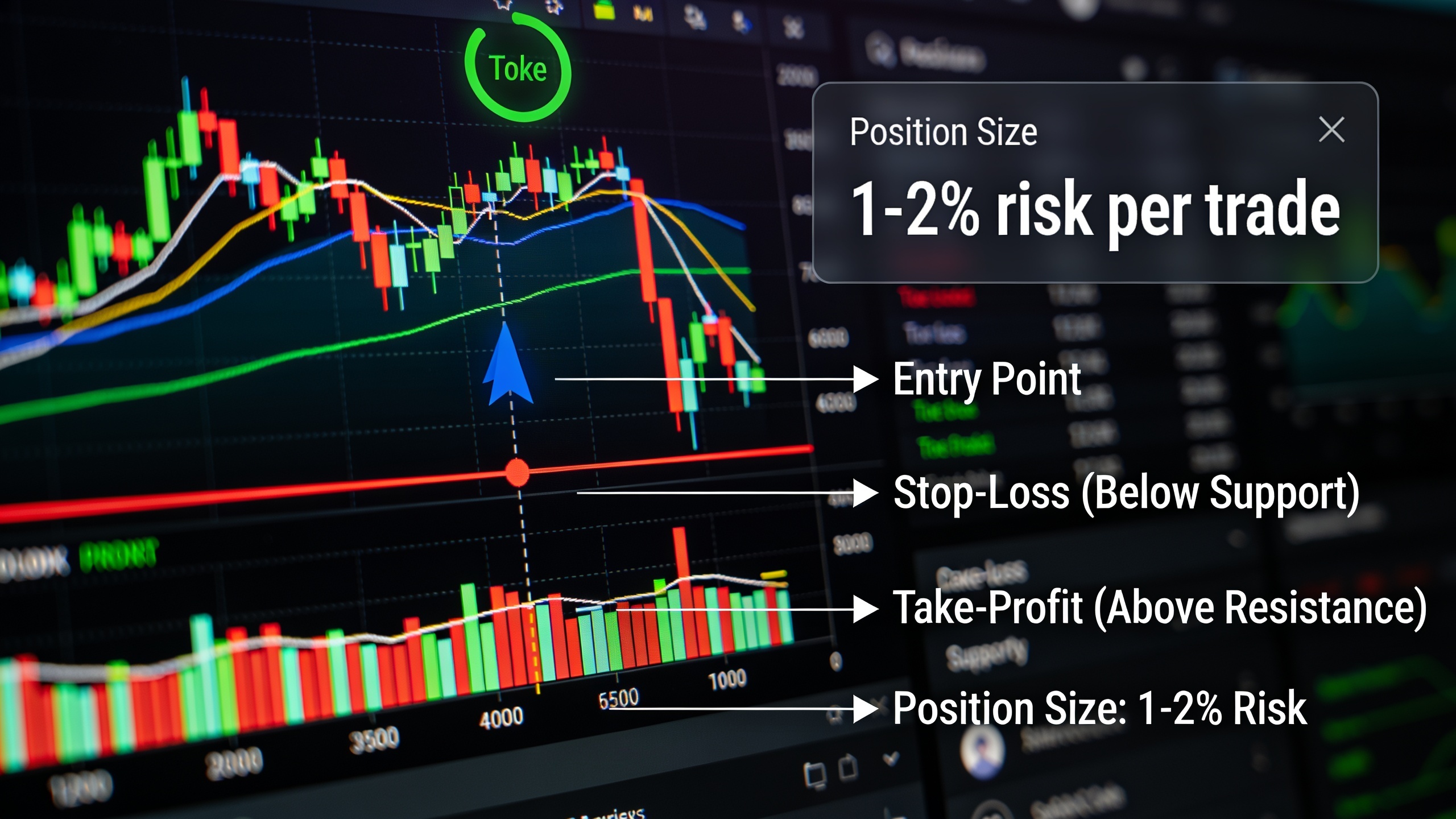
Every single trade needs a stop-loss set beforehand, usually just past a key support or resistance zone, and a position size small enough that a loss only costs you a sliver of your capital. Disciplined traders often cap it at 1-2% per trade. This is where charting bumps into actual financial planning; firms like Wealthmax make the point that even your highest-conviction trades should be sized inside a diversified portfolio rather than treated like all-or-nothing bets. Applies to crypto just as much as it does to anything else, maybe more.
Step 4: Choose the Right Platform and Data Source
Where you trade matters more than beginners think, because the platform decides your charting tools, execution speed, and fees. All of which quietly affect your results. Before you put money down, it's worth comparing your options in Best Crypto Exchanges Compared: Fees, Security, and Features, since a platform with weak liquidity or laggy data feeds can literally distort the signals you're trying to read.
Funny enough, the AI-coaching trend isn't just a finance thing. The same way State6 uses AI-powered coaching to help UK police officers prep for promotion assessments, a handful of crypto platforms now offer AI-driven pattern-recognition tools that flag possible setups for newer traders. Basically a coach that points at chart formations in real time and says "hey, look at this."
Step 5: Journal and Review
Keep a trading journal. Record the setup, the indicators you used, your entry, your exit, and how it played out. It's dull, and it's also one of the most reliable ways to actually get better. Read it back weekly and you'll start seeing which patterns genuinely work for your style and which ones you just wish worked because they look cool. Gut feeling lies. The journal doesn't.
Common Mistakes When Reading Crypto Charts
Most losses in technical trading come from misreading the context, not misreading the chart. A few mistakes show up over and over with newer traders, and catching yourself doing them is honestly more valuable than learning another indicator.
Overloading the Chart
Piling ten indicators onto one chart creates confusion, not clarity. Half of them are mathematically related anyway, so you end up with the same signal wearing five different costumes. Most experienced traders run two or three tools alongside price and volume, and that's it.
Ignoring Timeframe Context
A bullish signal on the 5-minute can be flatly contradicted by the daily chart. Trading purely off short timeframes without ever zooming out is one of the classic ways people get chewed up by false breakouts. Always glance at the bigger picture first.
Treating Indicators as Guarantees
Indicators tell you probability, not destiny. RSI at 80 doesn't mean "reversal now." It means momentum's been unusually hot and a pause or pullback is statistically more likely than not. Big difference.
Skipping Risk Management
Even a beautiful setup can blow up. Crypto is famous for violent, low-liquidity moves that tear through support in minutes, especially around big news or mass derivatives liquidations. The traders who skip stop-losses because they're "sure" about their read are exactly the ones who eventually take the losses that hurt.
There's a broader lesson here about patience, too. The same way travelers use platforms like Swappahome to plan careful, well-researched home exchanges instead of booking on a whim, good traders plan their entries and exits deliberately rather than reacting to every twitchy candle. Emotion is expensive. Planning is cheap.
FAQ: Crypto Technical Analysis
Does technical analysis actually work for crypto, or is it just guessing?
It's a probability tool, not a guarantee, and it works best in liquid markets with clear trends. Because crypto is so driven by sentiment, leverage, and round-the-clock trading, technical analysis tends to be more reliable on the daily and weekly charts than on the short ones, where noise and outright manipulation muddy everything up.
What's the best timeframe for reading crypto charts?
There isn't one "best" timeframe, it depends on your style. Day traders live on the 15-minute to 1-hour charts, swing traders usually prefer 4-hour to daily, and long-term investors stick to weekly or monthly. Most experienced traders check at least two together: a higher one for the trend, a lower one for timing the entry.
Do I have to learn every indicator to trade crypto well?
Nope. Most successful traders lean on a small core, a moving average, one momentum indicator like RSI or MACD, and volume, plus support and resistance. Knowing a few tools deeply beats fumbling with dozens every single time.
How's crypto technical analysis different from analyzing stocks?
The core methods are identical: candlesticks, indicators, support and resistance. But crypto trades 24/7, has thinner liquidity on a lot of pairs, and reacts way more sharply to leverage-driven liquidations. That makes volatility spikes and false breakouts a lot more common than you'd see in traditional stocks.
Can a beginner really learn to read crypto charts on their own?
Yes, but it takes steady practice, no way around that. Most people progress fastest by starting with candlestick basics and support/resistance, then adding one indicator at a time while practicing on historical charts or a demo account before risking a single real dollar.
At the core of it, reading crypto charts is a skill you build through reps, not one you memorize from a list. The same candlestick or the same crossover will look totally different across a hundred different market contexts, and it's experience that eventually teaches you how to weigh those differences without getting fooled. Start with the fundamentals here, look at real charts every day, and build in risk management from day one. Your analysis is going to be wrong sometimes. The whole point is making sure that being wrong never costs more than you can afford to lose.