On-Chain Analytics 101: Reading Blockchain Data Like a Pro
Here's something that still kind of blows my mind: every single transaction on a public blockchain is out there. Permanently recorded, timestamped, visible to anyone with a browser. That's it. That's...


Here's something that still kind of blows my mind: every single transaction on a public blockchain is out there. Permanently recorded, timestamped, visible to anyone with a browser. That's it. That's the whole foundation of on-chain analytics, which is really just the practice of pulling patterns and signals straight out of that public transaction data instead of staring at price charts all day hoping to divine the future.
And for crypto traders, that's a big deal. Because in a market where "information edge" usually means either insider knowledge or getting lucky, on-chain data is one of the last genuinely fair advantages left. Everyone sees the same data at the same time. The catch? Almost nobody actually knows how to read it.
So that's what we're going to fix. I'll walk you through the metrics the pros actually watch, why any of this matters when the market is mostly running on hype and liquidity, and how to stitch several signals together into something resembling a coherent view. Whether you just bought your first Bitcoin or you've been holding since the last cycle, the goal is to get you reading a blockchain like an analyst instead of a spectator.
Table of Contents
- What Is On-Chain Analytics?
- Active Addresses: Measuring Real Network Usage
- Transaction Volume and What It Really Tells You
- Exchange Flows: Following the Money
- Other Metrics Worth Watching
- How Do Traders Actually Use On-Chain Data?
- Best Tools for Blockchain Data Analysis
- Common Mistakes When Reading On-Chain Data
- FAQ
What Is On-Chain Analytics?
On-chain analytics is the process of collecting and interpreting the data recorded directly on a blockchain, stuff like wallet balances, transaction counts, and token movements, to figure out what's actually happening on a network and how investors are behaving. What makes it different from regular market analysis is the source. Traditional analysis leans on earnings reports and third-party estimates. On-chain analytics works from a public ledger that anyone can verify for themselves. No trust required.
Think about it this way. Every Bitcoin or Ethereum transaction leaves a trail behind: a sending address, a receiving address, an amount, a timestamp, a fee. Now multiply that by millions of transactions a day and you've got this massive, structured record of what people are doing with their money. Not what they're tweeting. What they're actually doing. Analysts scrape all of that using blockchain explorers, node queries, or specialized platforms, then turn the raw mess into readable numbers like active addresses, exchange flows, and holder distribution.
Why does any of this matter for trading? Because price lags behavior. A lot of what shows up on your chart already happened on-chain hours or days earlier. A whale moving coins onto an exchange, a sudden burst of new wallets, a weird drop in fees, these things tend to lead the price, not follow it. That gap is the whole point. It's the edge on-chain analysis is built to catch, and it's a big reason why both institutional desks and obsessive retail analysts have folded it into their research.
Active Addresses: Measuring Real Network Usage
Active addresses are the number of unique wallets that sent or received a transaction on a blockchain during a given period, usually measured per day. It's about the simplest gauge you've got for how much real activity is happening, as opposed to how much noise is happening on Crypto Twitter.
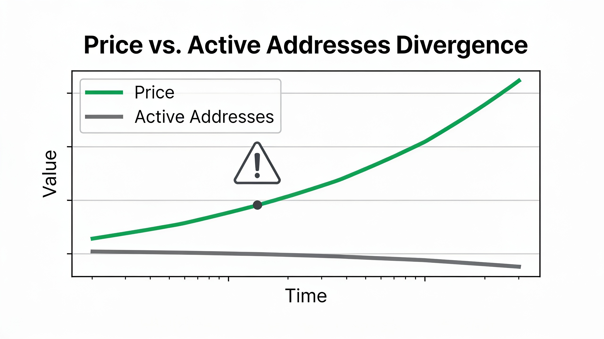
When active addresses are climbing, that usually means adoption is growing, more traders are getting in, or people are genuinely using the network for payments, DeFi, whatever. When the count's been sliding for weeks, interest is probably fading even if price hasn't admitted it yet. Analysts split this into two figures: total active addresses (everything transacting) and new addresses (wallets showing up for the very first time). A jump in new addresses alongside a rising price? That's usually fresh money walking in the door. A price rocketing up with active addresses going nowhere? That often means a handful of big holders are doing all the work, not the broad market.
One thing worth flagging, and people forget this constantly. One person can control hundreds of addresses. And one address, say an exchange's hot wallet, can represent thousands of users. So active address counts aren't a headcount. They're directional. They shine when you watch them as a trend over weeks, not when you obsess over a single day's number.
Why Active Addresses Move Before Price
Big upticks in active addresses have historically tended to show up before major rallies, and the logic is pretty intuitive. New demand appears as network usage first, then as sustained buying pressure on exchanges later. So the usage leads. On the flip side, a network printing fresh all-time highs in price while active addresses just... sit there? That's the kind of thing analysts flag as a market getting speculative and running out of real fuel. That divergence between price and usage is honestly one of the first things any experienced on-chain person checks before deciding whether a rally has actual legs or it's just vibes.
Transaction Volume and What It Really Tells You
Transaction volume is the total value moved across a blockchain over a set period, and it tells you how much economic activity is actually flowing through the network. Note: this is not the same as trading volume on an exchange, which is just buy and sell orders on some trading venue. Different thing entirely.
There are two flavors here, and the distinction matters more than people realize. Raw volume is the total dollar or token value moved, full stop. Adjusted volume filters out the junk, internal transfers, exchange shuffling, all the transactions that don't represent anything real. And raw numbers can absolutely mislead you, because a whale bouncing funds between two of their own wallets counts exactly the same as a genuine payment between two strangers. That's why serious analysis almost always leans on adjusted or "entity-adjusted" volume when it's trying to measure real demand.
Now, rising transaction volume plus rising active addresses is the healthy combo. Organic growth. Everybody's happy. But rising volume with flat or falling active addresses usually means fewer, bigger players are moving larger sums, and that can be the setup for either serious accumulation or serious distribution depending on which way those wallets are pointed. This ties directly into crypto whale tracking, where analysts zero in on the big holders specifically to see whether smart money is loading up or quietly bailing before everyone else catches on.
Oh, and transaction fees are worth a glance too. On Ethereum, spikes in average fees usually mean congestion from high demand, whether that's trading, NFT minting, or DeFi going nuts. But if fees stay low even when the market's clearly busy, that's often a sign a lot of the action has migrated to Layer 2 networks. We got into that shift in more detail over in our breakdown of Layer 2 blockchain solutions and how they're scaling Ethereum and beyond.
Exchange Flows: Following the Money
Exchange flows measure how much crypto is moving onto centralized exchanges (inflows) versus how much is leaving for private wallets (outflows). This one is arguably the single most-watched on-chain metric among active traders, and for good reason. It gives you a direct read on whether holders are gearing up to sell or settling in to hold.
Big inflows to exchanges usually get read as bearish, because people generally move coins to an exchange when they're planning to sell or trade. Big outflows read bullish, because pulling coins off an exchange into cold storage says "I'm not selling anytime soon." Analysts track this both at the market level (net flows across all the major exchanges) and exchange by exchange, since a spike tied to one specific platform might just be that exchange's own news rather than a real market-wide mood swing.
The net figure, inflows minus outflows over some window, gets layered against price to spot divergences. If price is climbing while net flows to exchanges are also climbing, that rally might be running straight into fresh sell-side supply, which sometimes signals a local top. If price is dropping but coins keep steadily leaving exchanges, that often reads as long-term holders accumulating even while everyone else is panicking.
| Exchange Flow Signal | Typical Interpretation | Common Trader Reaction |
|---|---|---|
| Large inflow spike | Holders preparing to sell | Caution, tighten stops, watch for local top |
| Large outflow spike | Holders moving to cold storage / long-term holding | Bullish bias, potential accumulation |
| Sustained net outflow over weeks | Reduced exchange-available supply | Watch for supply squeeze on demand spike |
| Sustained net inflow over weeks | Rising exchange-available supply | Watch for downside pressure or distribution |
| Flow spike tied to single exchange | May reflect exchange-specific news, not market-wide sentiment | Cross-check with other exchanges before acting |
But don't treat exchange flows as gospel on their own. A giant inflow could be a whale about to dump, sure. Or it could be collateral getting deposited for a derivatives position. Or a fund just consolidating custody. Totally different meanings, same-looking data. Which is exactly why you read exchange flows next to other stuff, active addresses, whale behavior, never in a vacuum.
Other Metrics Worth Watching
Active addresses, transaction volume, and exchange flows are the core three. But a few other metrics show up constantly in serious analysis and fill in the rest of the picture, so let's run through them.
Holder distribution is about how coins are spread across wallet sizes, splitting out the whales (the really big holders), the mid-size folks, and the little retail wallets. A market where a tiny number of wallets sits on a huge chunk of supply is fragile by nature. One of them decides to move and the whole thing can lurch.
Realized cap and MVRV (market value to realized value) compare a coin's current market cap against the aggregate price at which every coin last actually moved on-chain. When MVRV runs unusually high, the average holder is sitting on fat unrealized profits, and historically that's when sell pressure starts building up. When it's low or negative, the market's broadly underwater, which has often lined up with long-term bottoms in past cycles. Not a crystal ball. Just a pattern that keeps recurring.
Stablecoin supply on exchanges tracks how much dollar-pegged liquidity is parked on trading platforms, ready to fire. Rising stablecoin reserves? Often read as dry powder waiting to buy. Falling reserves can mean capital is being yanked out of the market entirely.
And then there's miner or validator behavior, which really matters for proof-of-work assets like Bitcoin. Analysts watch whether miners are hoarding their block rewards or dumping them, because miner selling can genuinely move short-term supply dynamics.
Stack all of these together and you're building conviction around a thesis instead of jerking your knee at a single number. It's the same layered thinking that's driving interest in tokenized traditional assets, where public-ledger transparency is turning into a selling point of its own. Our piece on real-world asset tokenization and why Wall Street is watching digs into how that exact transparency is now getting applied to bonds, real estate, and private credit.
How Do Traders Actually Use On-Chain Data?
Traders use on-chain data to confirm or poke holes in whatever story the price chart is telling, basically cross-checking sentiment against real on-chain behavior before they pull the trigger. It almost never works as a standalone trading system, and anyone selling you that idea is selling you something. It works best as a filter sitting on top of technical and macro analysis.
Here's a pretty typical workflow. A trader spots a coin breaking out on the chart. First thing they do is check whether active addresses and adjusted volume are rising with it, because that would suggest the move is backed by real demand and not just thin, air-pocket liquidity. Then they look at exchange net flows, are the big holders adding or trimming during this move? If whales are accumulating and outflows are beating inflows, that gives most traders more nerve to hold through the chop. If it's the reverse, that same breakout suddenly deserves a lot more side-eye.
Longer-term investors use the same data but for different questions. They're looking at MVRV and holder distribution to figure out where the cycle stands, not to time some individual trade. When long-term holder supply keeps quietly growing while short-term holder supply shrinks, that's usually read as coins moving into stronger hands. Historically that pattern shows up in the late stages of a bear market or the early accumulation phase before a new cycle kicks off.
There's actually a neat parallel here to how people size up opportunities way outside of crypto. Just like a trader cross-references multiple signals before committing capital, job seekers are leaning more and more on data-driven scoring tools to decide where to spend their energy. Platforms like JobScans use an AI-driven fitment score against your resume to help you figure out which roles are genuinely worth chasing, instead of firing off a hundred applications and praying. Same underlying logic, honestly: use structured data to narrow where your effort (or your money) actually belongs, rather than trusting your gut and hoping.
Best Tools for Blockchain Data Analysis
There's no single "official" source for on-chain data, so traders end up cobbling together a mix of blockchain explorers, analytics dashboards, and data platforms that each specialize in different chains and metrics. Public explorers let anyone look up individual transactions, balances, and address histories directly, which is great when you want to verify some specific whale wallet or transaction you heard about on a Discord. Dedicated analytics platforms go further, chewing through the raw ledger and spitting out pre-built charts for active addresses, exchange flows, MVRV, and dozens of other metrics so you're not querying a node by hand like it's 2013.
| Tool Category | What It's Best For | Limitation to Keep in Mind |
|---|---|---|
| Public blockchain explorers | Verifying individual transactions and wallet histories | No aggregated trend charts; manual, transaction-by-transaction view |
| Aggregated on-chain dashboards | Tracking active addresses, exchange flows, MVRV over time | Depth of free data often limited; advanced metrics may require a subscription |
| Whale-tracking alert services | Real-time notification of large wallet movements | Can generate false signals from exchange-internal transfers |
| DeFi-specific analytics platforms | Monitoring liquidity pools, lending protocol activity, and yield flows | Coverage varies significantly by chain and protocol |
Whatever combination you land on, the point is the same. Turn those raw, timestamped records into a routine you actually check, the way you'd check a price chart, instead of something you only glance at when the market's already on fire.
Common Mistakes When Reading On-Chain Data
The most common mistake, by a mile, is treating one metric as a standalone buy or sell signal instead of one input among several. A spike in exchange inflows looks terrifying in isolation. But if it's happening while strong outflows are firing off somewhere else, or it lines up with a scheduled event like an exchange reshuffling its cold wallets, that "bearish" signal might mean absolutely nothing.
Second mistake: ignoring exchange-internal transfers. Exchanges constantly shuffle huge sums between their own hot and cold wallets for security and liquidity reasons, and on a naive dashboard that can show up as some monster whale movement even though not a single coin got bought or sold. The good platforms label and filter these known exchange wallets. But it's always worth double-checking the source of any dramatic alert before you go reacting to it and doing something you'll regret.
Third, and I'm guilty of this one myself sometimes, over-indexing on short time frames. Daily active address counts and daily exchange flows are noisy. One-off events, network upgrades, even time-zone-driven activity patterns can throw them around. Most pros smooth all that out with 7-day or 30-day moving averages instead of freaking out over a single day.
And finally, a lot of newcomers forget that on-chain analytics describes on-chain behavior specifically. It says nothing about what's happening inside a centralized exchange's own order books, because those trades never touch the public blockchain until someone deposits or withdraws. That's a real gap. A staggering amount of daily crypto trading happens entirely within an exchange's internal ledger, completely invisible to on-chain analysis until the funds finally move on or off the platform. Keep that blind spot in mind.
FAQ
So what's the actual difference between on-chain analytics and technical analysis?
Technical analysis studies price and trading volume patterns on a chart to forecast where price goes next. On-chain analytics studies the underlying blockchain data itself, the wallet activity, transaction counts, exchange flows, to understand the behavior driving those price moves in the first place. Plenty of traders run both together, using on-chain data to either back up or question whatever the chart seems to be shouting.
Is on-chain data actually free?
In principle, yeah. Public blockchains are open ledgers, so anyone can query them directly through a node or a free explorer. In practice, most traders use analytics platforms that pre-chew all that raw data into readable charts. A lot of them have free tiers with the basics, but the more advanced stuff (entity-adjusted volume, detailed whale segmentation) usually lives behind a paid subscription.
Can on-chain analytics predict crypto crashes?
It can flag conditions that have historically lined up with higher risk, things like rising exchange inflows, a sky-high MVRV, or supply concentrated in just a few wallets. What it can't do is tell you the exact timing or size of a crash. Think of it as a risk-assessment tool that tilts the odds in your favor, not some guaranteed early-warning siren. Anyone claiming otherwise is overselling it.
Which blockchains have the best coverage?
Bitcoin and Ethereum, hands down. They've got the deepest, most mature analytics coverage thanks to their age, their transaction volume, and their giant analyst communities, so metrics like active addresses, MVRV, and exchange flows are well-established for both. Newer or smaller chains? Coverage tends to be thinner, so if you're working with less-established chains you'll probably lean harder on manual explorer checks than on nice pre-built dashboards.
Do I need to know how to code for this?
Nope. Most retail traders never touch raw blockchain data directly. They use dashboards that hand you the data as ready-made charts and alerts. Honestly, understanding the concepts, what active addresses or exchange flows actually measure, matters way more for making good calls than any coding chops ever will.
Reading blockchain data like a pro isn't about memorizing every metric on some dashboard. It's about learning which combination of signals, active addresses, transaction volume, exchange flows, tends to move together in ways that actually matter for whatever you're trading. My advice? Start by tracking two or three metrics consistently over a few weeks instead of bouncing between a dozen dashboards. Let the patterns build your intuition the same way chart patterns do. Over time, that habit of checking price against real on-chain behavior is exactly what separates the people reacting to headlines from the ones seeing the next move coming.